VOID//DIVISION
A futuristic streetwear brand identity built for outsiders, combining bold visual systems, premium packaging, campaign direction, and social media design into one cohesive brand experience.
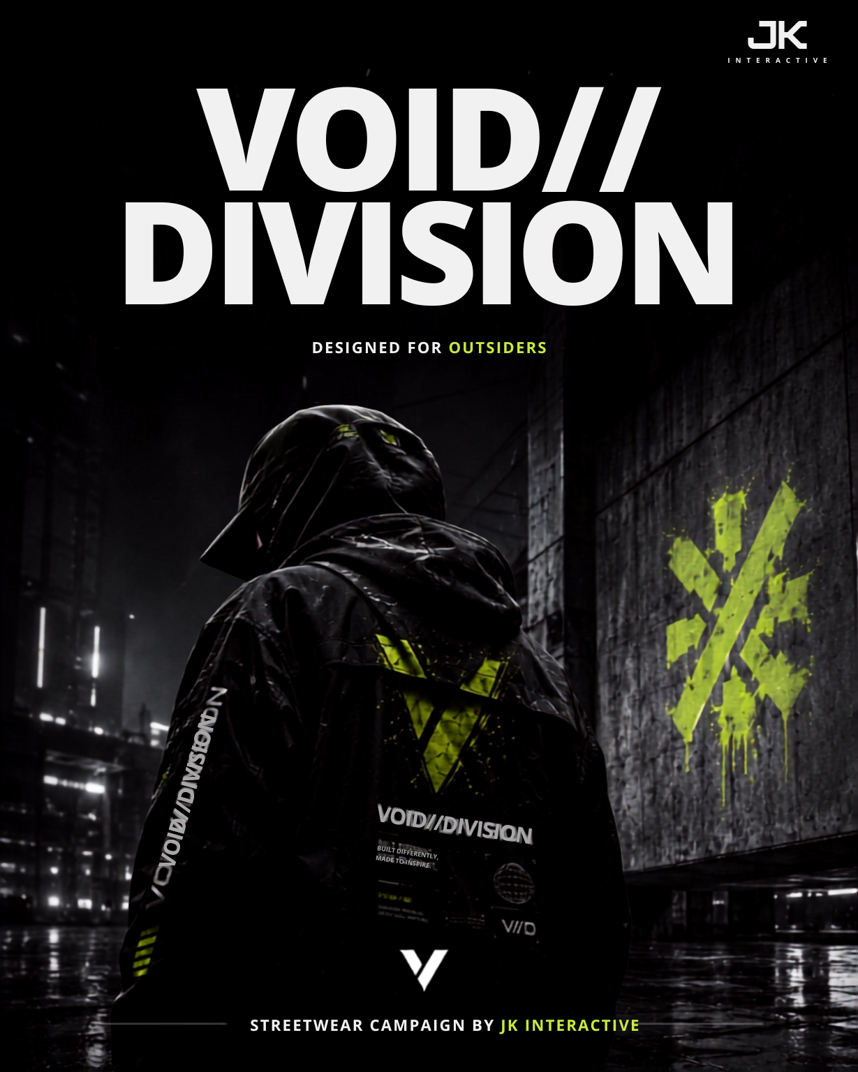
The Challenge
VOID//DIVISION was envisioned as a conceptual streetwear brand built around rebellion, individuality, and futuristic aesthetics. The challenge was to create a visual identity that felt bold enough to stand out in the highly competitive fashion industry while remaining minimal, premium, and instantly recognizable. Every brand touchpoint—from the logo and typography to packaging, campaign visuals, and social media—needed to communicate the same underground attitude without sacrificing consistency or usability. The objective was to build a complete identity system that could realistically launch as a premium fashion label.
The Approach
The brand was developed around a cohesive visual system that combines minimalism with high-impact graphic design, ensuring every customer interaction reinforces the VOID//DIVISION identity.
- Brand Identity & Visual System: A bold wordmark, custom graphic language, modern typography, and a monochrome-first color palette were designed to establish a distinctive and memorable brand presence.
- Packaging & Brand Experience: Every packaging element—including shipping boxes, apparel tags, labels, and supporting collateral—was designed as an extension of the brand, creating a premium unboxing experience that reflects the same futuristic aesthetic.
- Campaign & Digital Presence: A complete collection of campaign posters and social media assets was created using bold typography, striking compositions, and consistent art direction, enabling the brand to communicate a unified identity across both physical and digital platforms.
Brand Identity System
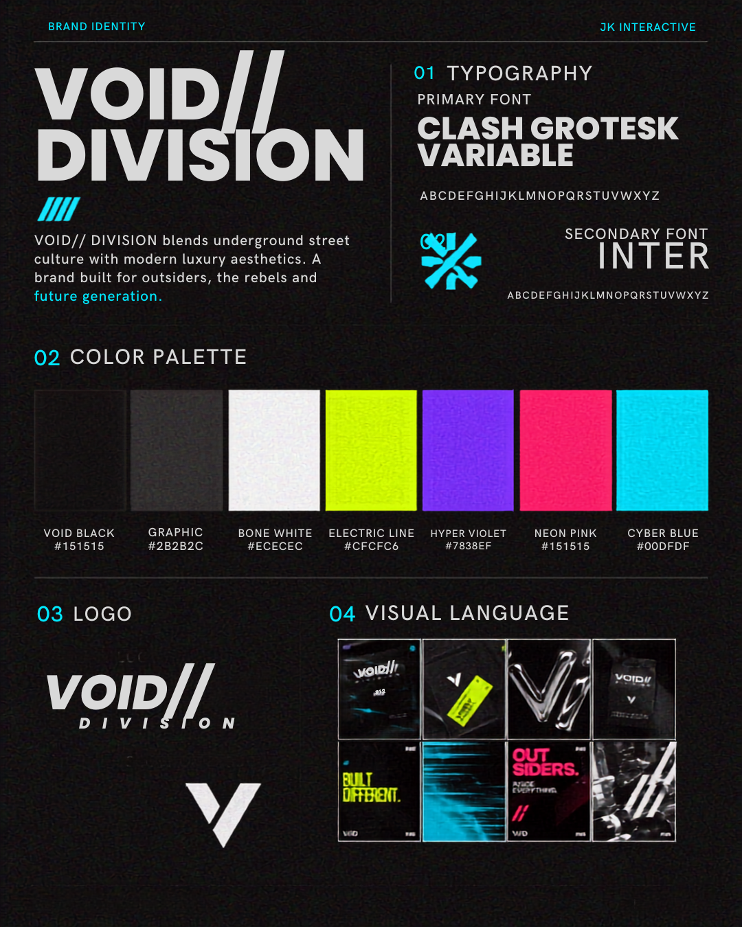
The foundation of VOID//DIVISION was built around a bold yet minimal visual identity that captures the brand's rebellious streetwear attitude. Every design decision—from typography and logo construction to color application and supporting graphics—was created to ensure consistency across apparel, packaging, marketing, and digital platforms.
- Logo System: Modern wordmark and supporting brand marks designed for flexible application across clothing, packaging, and digital media.
- Typography: Bold display typography paired with a clean sans-serif to create a strong visual hierarchy while maintaining excellent readability.
- Color Palette: A monochrome foundation enhanced with vibrant accent colours to reinforce the futuristic and underground aesthetic.
- Visual Language: High-contrast layouts, oversized typography, structured grids, and minimal graphic elements create a distinctive brand personality.
- Design Focus: Building a scalable identity system capable of adapting seamlessly across physical products, campaign materials, and digital experiences.
Extending the Brand Beyond Apparel
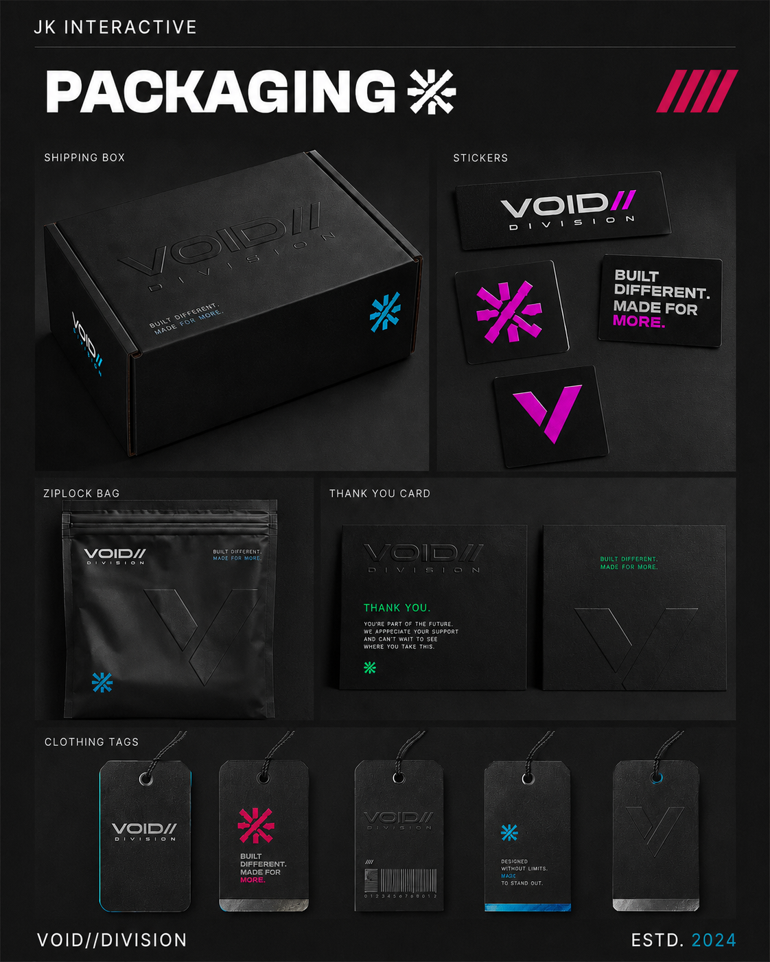
Every packaging element was designed as an extension of the VOID//DIVISION identity, creating a premium unboxing experience that reflects the brand's bold, modern, and minimalist aesthetic. Every touchpoint reinforces the same visual language while maintaining consistency across physical products.
- Packaging System: Custom shipping boxes, apparel tags, labels, and supporting materials were designed as one cohesive identity rather than separate assets.
- Visual Language: Bold typography, monochrome layouts, and clean compositions create a premium presentation inspired by contemporary streetwear culture.
- Brand Experience: Every packaging element works together to strengthen brand recognition and deliver a memorable customer experience from purchase to unboxing.
Campaign Posters
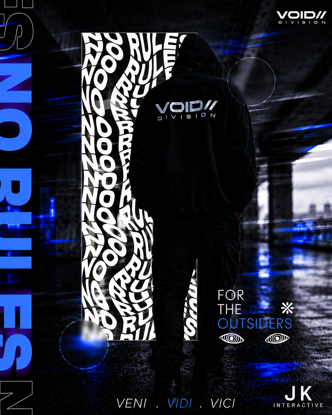
High-impact visual statements designed for outdoor displays, digital billboards, and print collateral. The campaign poster series establishes the raw aesthetic and underground narrative of VOID//DIVISION.
Poster Series 01 — Architectural Void
Featuring stark monochrome imagery, heavy typographic contrast, and minimalist grid alignments. Poster 01 emphasizes spatial geometry and modern brutalist design principles to command attention in urban environments.
- Focus: Structural visual rhythm & typographic hierarchy
- Application: Large format wild postings & digital displays
- Palette: High-contrast monochrome with industrial accents
Poster Series 02 — Digital Underground
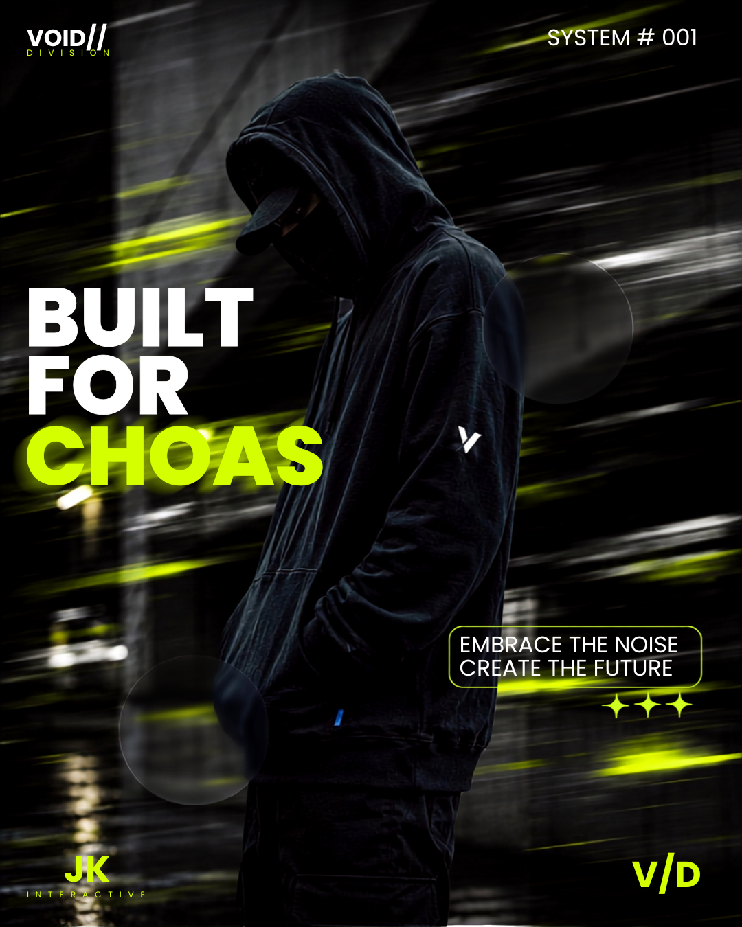
Poster 02 explores graphic textures, technical specifiers, and progressive brand typography. It expresses the brand's rebellion through structured design layout, creating an elevated streetwear identity.
- Focus: Tactical typography & distorted brand graphics
- Application: Lookbook covers & promotional wheatpaste prints
- Palette: Deep obsidian with subtle metallic sheen
Social Media Campaign
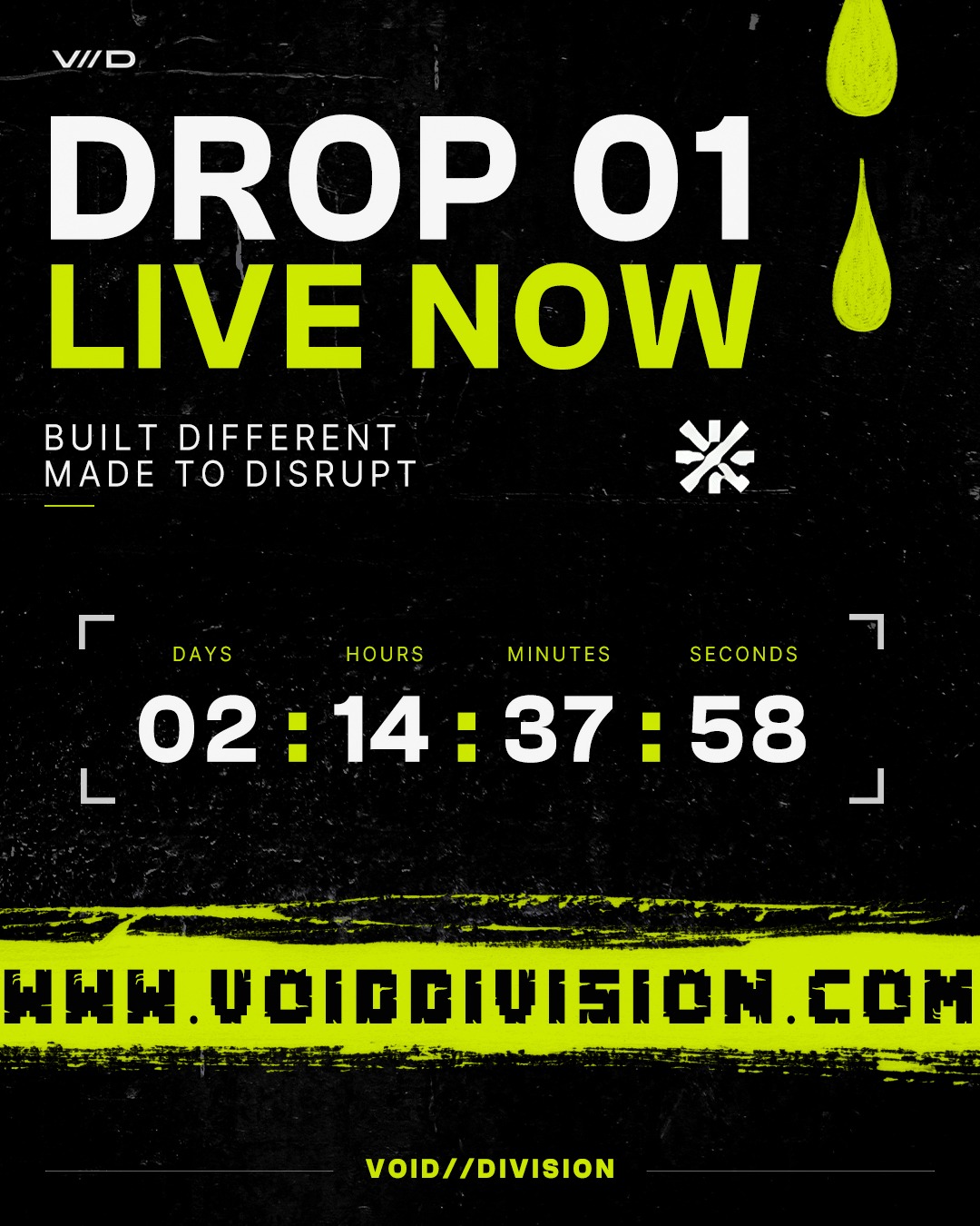
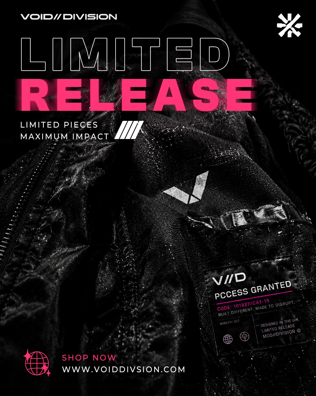
Extending the brand identity into high-engagement digital formats. The social media visual framework ensures that every Instagram post, story, and promotional graphic presents a consistent, high-fashion aesthetic across all devices.
Cohesive Digital Presence
By translating the brand's core design language—stark typography, negative space, and dark modern aesthetics—into digital templates, VOID//DIVISION maintains an elevated brand image across all social touchpoints.
Grid Systems & Templates
Modular feed layouts designed for product drops, capsule announcements, and editorial editorials.
Editorial Content Strategy
Dynamic story frames and motion teasers engineered to drive engagement and brand authority.
Ready to elevate your brand?
Let us craft a premium visual system that tells your story and drives growth.