Kaze
Brand identity, premium packaging & visual direction for a boutique restaurant.
The Challenge
Kaze, an upscale boutique dining concept, faced a critical misalignment between its culinary excellence and its brand presentation. Despite offering a refined minimalist culinary philosophy rooted in Japanese tradition, its existing brand assets felt generic, failing to command the premium positioning necessary to attract discerning clientele. To establish high-end market authority, Kaze required a cohesive, authentic Japanese brand identity that would elevate customer perception. The primary challenge was translating this quiet luxury across all physical and digital touchpoints ensuring that every interaction, from the physical menu to the digital feed, felt custom, premium, and unified.
The Approach
We established a comprehensive brand strategy focused on quiet luxury and meticulous craftsmanship, crafting a cohesive brand experience across three core pillars:
- Visual Identity & Typography: We designed a custom logotype paired with an editorial serif typeface and clean sans-serif secondary typography, balancing contemporary sophistication with traditional Japanese restraint.
- Packaging System & Menu Design: We developed an elevated packaging system and minimal menu layout, utilizing premium tactile material choices and structured grids. This physical design transforms simple touchpoints like take-away packaging and menu selection into a sensory extension of the dining experience.
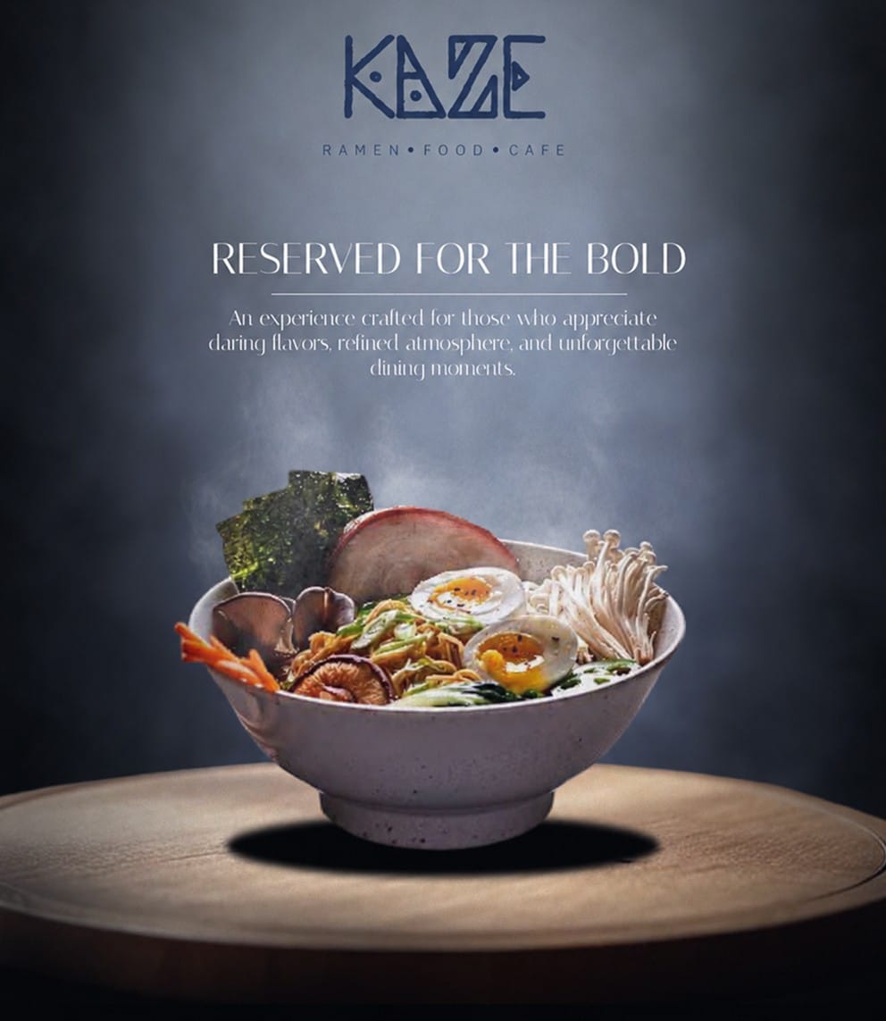
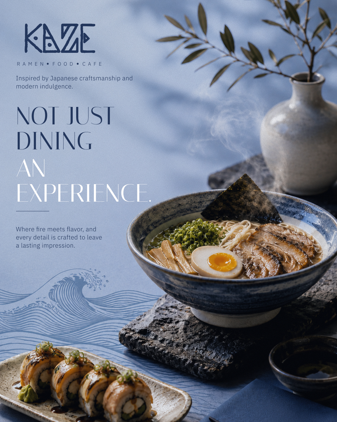
- Social Media Visual Language: We curated a visual narrative for digital platforms, blending atmospheric culinary photography with a structured grid and a sophisticated neutral color palette, ensuring a consistent brand experience online and offline.
Brand Identity System
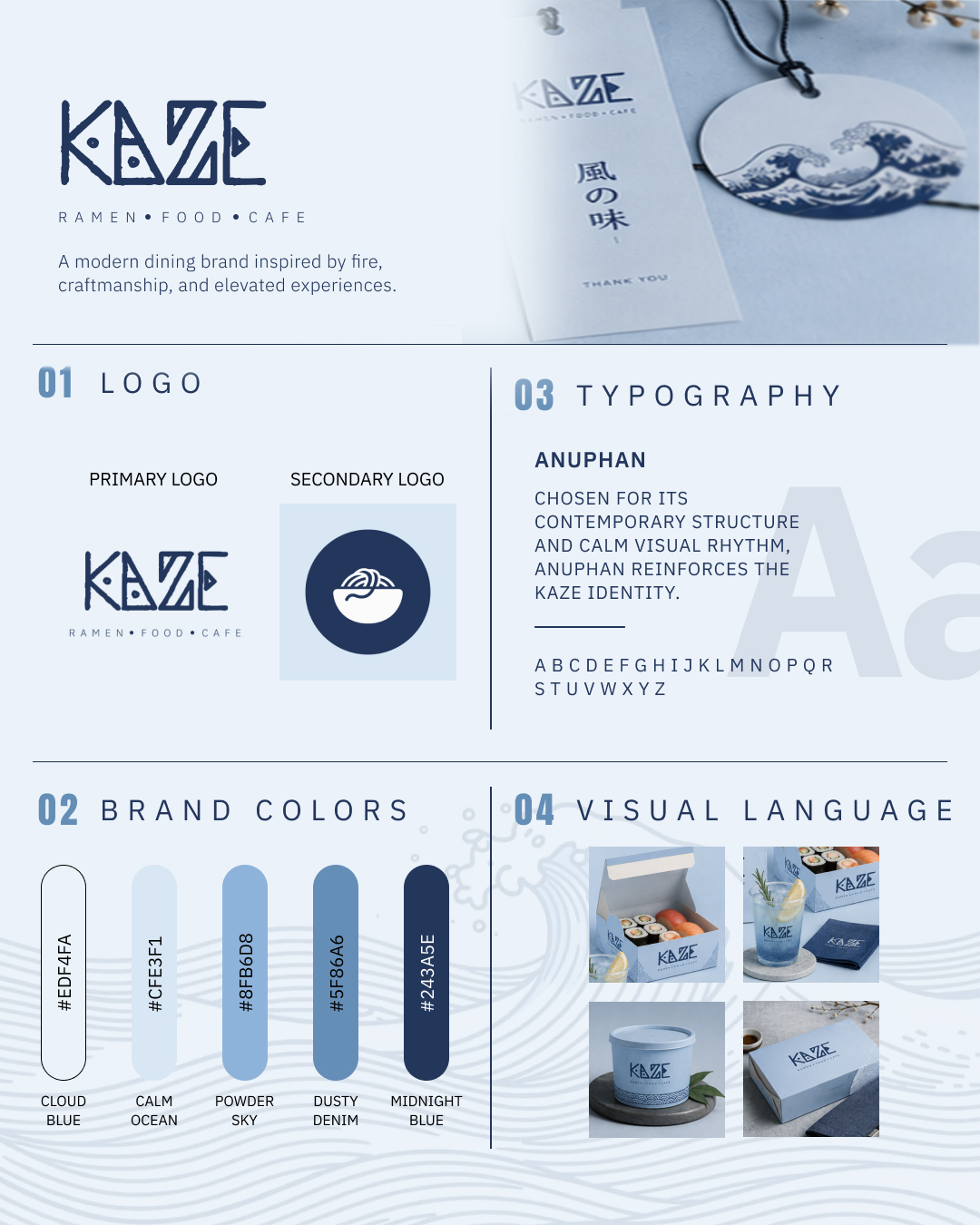
The visual identity for Kaze was created to capture the essence of refined Japanese culinary art. Grounded in principles of quiet luxury, organic minimalism, and subtle geometry, every design element reflects the high standards of bespoke gastronomy.
- Logotype & Brand Marks: Custom typography and handcrafted emblem rooted in Japanese calligraphy traditions.
- Typography System: High-contrast editorial display font paired with clean sans-serif secondary typography for effortless legibility.
- Color Palette: Soft warm neutrals, deep obsidian charcoal, and subtle gold foil accents evoking timeless sophistication.
- Visual Language: Generous negative space, tactile paper textures, and minimal graphic lines that let craftsmanship shine.
Menu Design
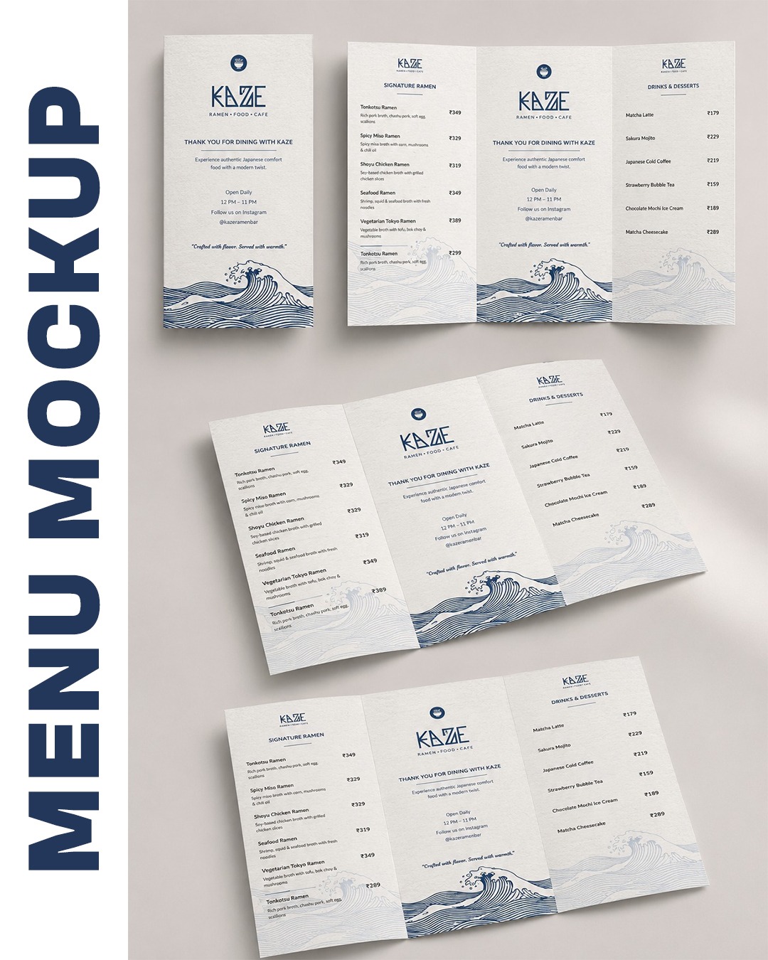
The menu was designed to reflect Kaze's modern Japanese dining experience through a clean, minimal layout with subtle cultural influences. A refined typographic hierarchy, generous white space, and handcrafted wave illustrations create an elegant menu that's easy to browse while reinforcing the restaurant's premium brand identity.
- Layout: Minimal tri-fold menu with a structured grid for effortless readability.
- Typography: Plus Jakarta Sans for headings & Inter for menu items and descriptions.
- Visual Elements: Traditional Japanese-inspired wave illustrations with subtle textured backgrounds.
- Color Palette: Soft ivory, deep navy blue, and muted grey for a timeless, premium aesthetic.
- Design Focus: Clean organization, clear pricing, balanced spacing, and a sophisticated dining experience.
Packaging Design
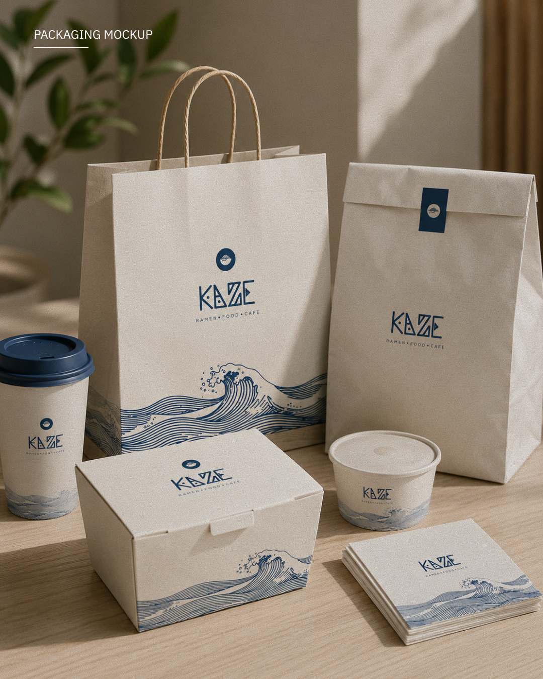
The physical packaging was conceived as a tactile extension of the Kaze dining room, translating the brand's minimalist aesthetic into a tangible, high-end unboxing experience.
- Packaging Strategy: Rather than simple containers, each box, bag, and sleeve serves as a brand touchpoint designed to build anticipation. The design maintains clean layout lines, custom blind-embossed brand marks, and single-origin label wraps.
- Material Choices & Premium Presentation: Committed to sustainability without sacrificing luxury, we selected uncoated, textured FSC-certified papers, recyclable plant-based inks, and organic linen ties. The raw, tactile feel of the paper reflects the natural, unadulterated ingredients of the cuisine.
- Brand Consistency & Customer Experience: By keeping the branding understated—using off-white boxes with blind debossing and single-color typography—we created an elegant aesthetic that feels premium rather than loud. This cohesive system ensures that takeout and gift packaging feel just as exclusive as in-restaurant dining, completing the brand's visual storytelling.
Social Media Visuals
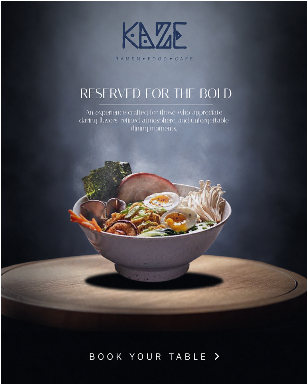
Strategic social media assets extending Kaze’s premium visual identity across digital platforms.
Instagram Feed
A cohesive grid system delivering a consistent, upscale aesthetic.
Story Design
Vertical formats that keep engagement while preserving brand language.
Promotional Creatives
Stylish posts for offers, events, and seasonal campaigns.
Campaign Visuals
High‑impact graphics that reinforce brand recognition and consistency.
Ready to elevate your brand?
Let us craft a premium visual system that tells your story and drives growth.